Relief Beyond Ground, Part 2
I really wanted to probe the multiple meanings of the word relief. The topographical nature of the textiles evokes the artistic interpretation of the word, and the context of the gallery and the presentation of the textiles begins to relieve the perceptions and boundaries around art; but in the pacing of the exhibition’s experience, I wanted to also bring attention to physical, tension relief.
As I mentioned before, I wanted to control the pace at which viewers traversed the space and I did a lot of this through the orientation of the floor pieces. However, I counterpart in the walls’ layout to reinforce this, and to offer conversational experiences as the viewers moved through the gallery.
For this exhibition, then, I created two spaces with curated requests for interaction.
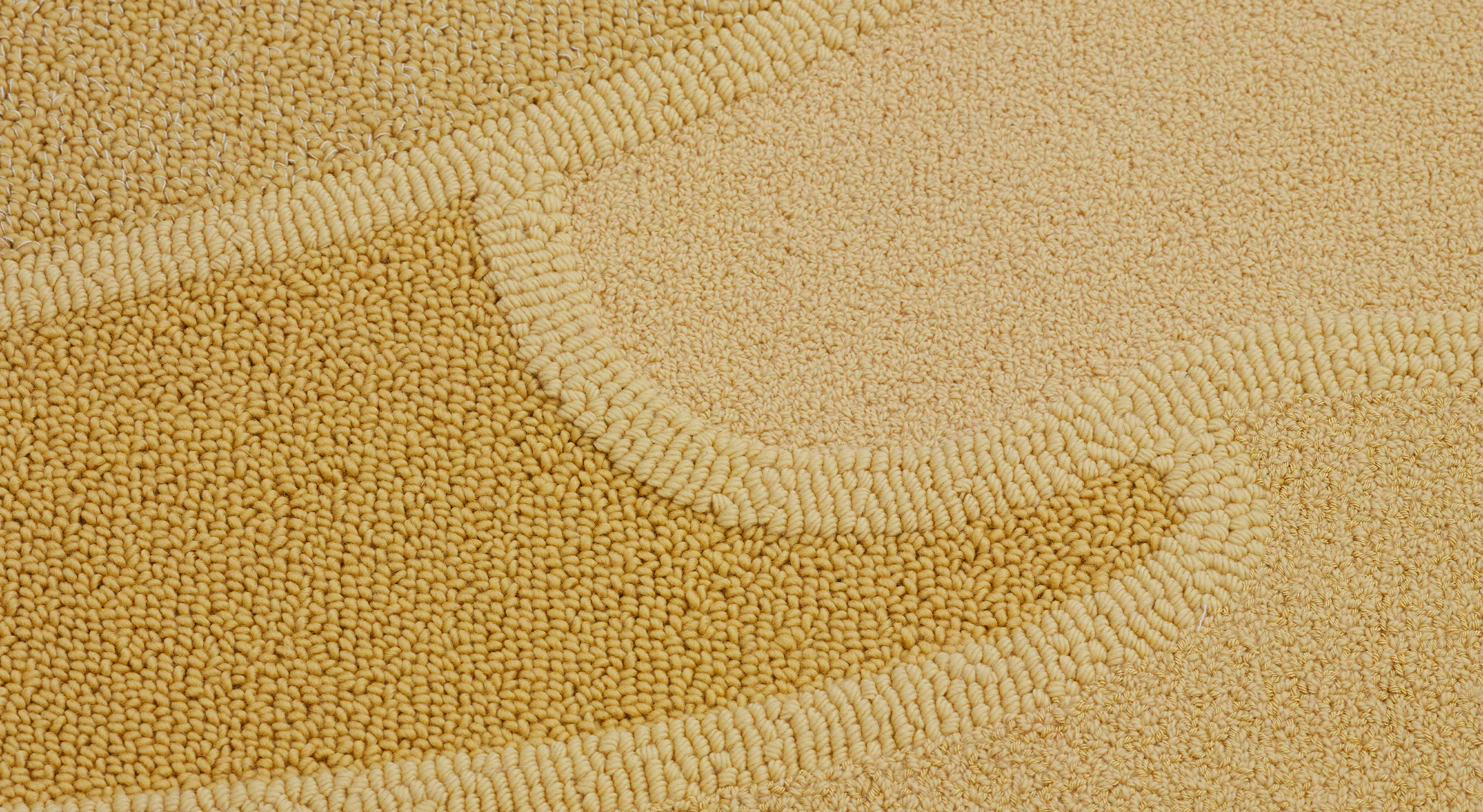
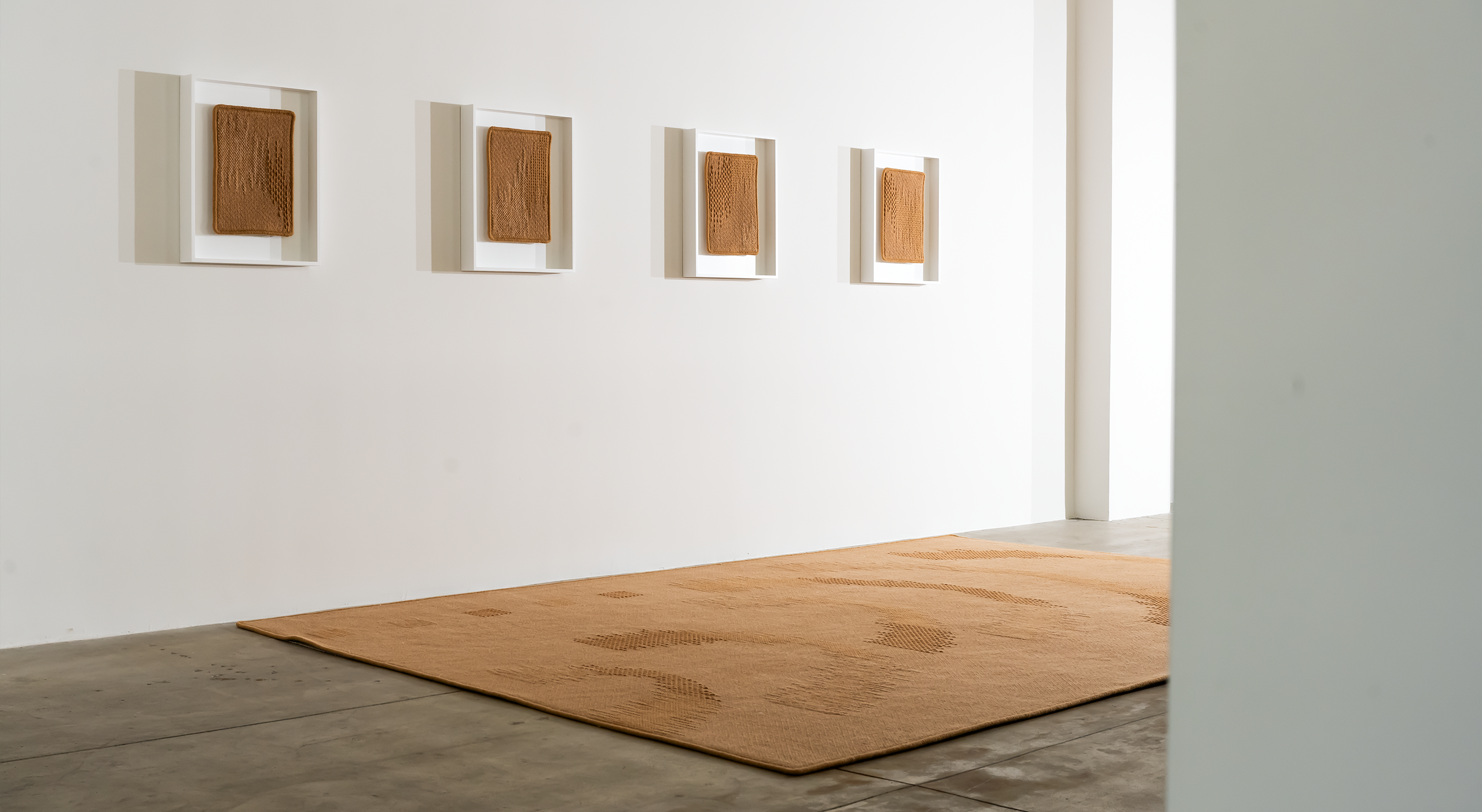
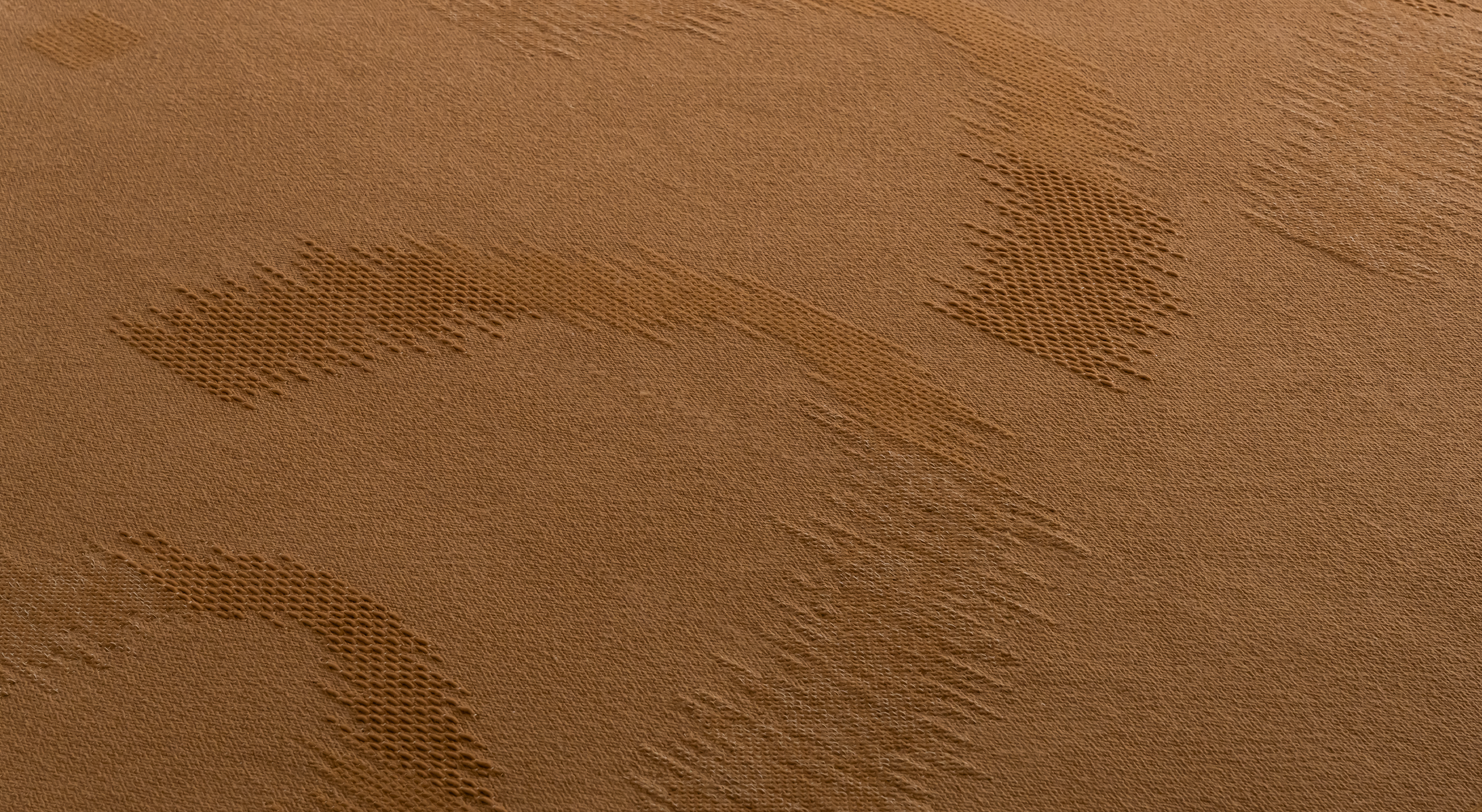
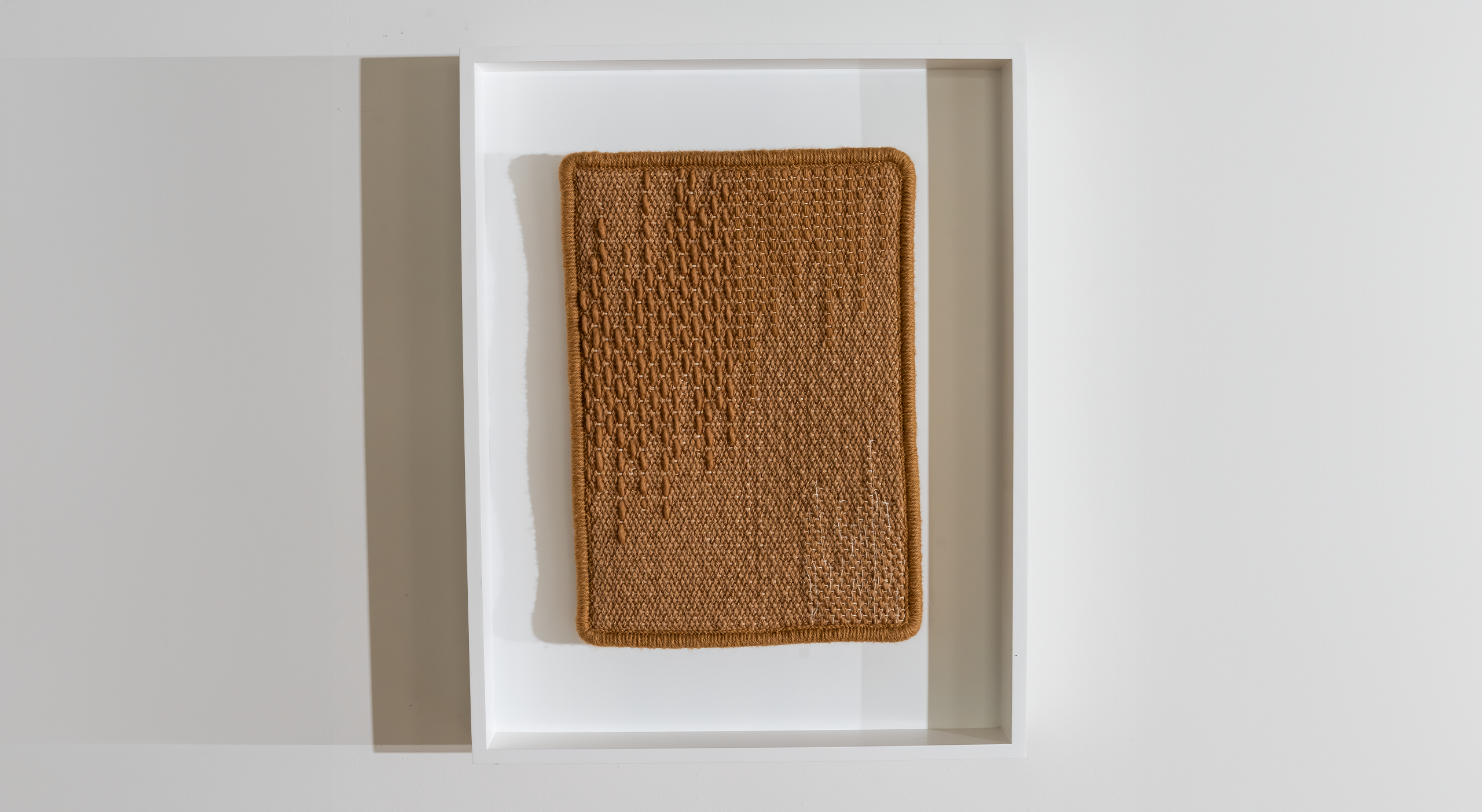
Because Mantra is an asymmetrical design, I wanted to highlight all of the details in its weave and handwork. I wanted to draw connections between different parts of the rug, as well as connections between it and neighboring pieces in the space. Layered with that was an opportunity to make the conversation around fine art and textiles more explicit, as different sections of the piece were called out and displayed on the wall in formal frames.
With this installation, I wanted to highlight too that even our miniature works are made by artists, and they are works of art themselves, whether or not they connect to a larger piece. I wanted to elevate our smaller textiles and bring attention to their craftsmanship and materiality, while also opening up a bigger conversation about the full piece.
I wanted to create spaces where people are able to focus on the details. It’s hard to notice these things when you are confronted with a bunch of textiles on the walls and floor. It’s easy to dismiss them because they are all doing similar things.
When you have various small pieces that are making reference to the piece that you’re walking on, though, it brings attention to questions of their relationship. Why is there this relationship between what I’m seeing on the wall and what I’m seeing on the ground?
When they’re framed and isolated, each given their own moment, the different sections of the textile are illuminated. People start to pick out little details, and then look back to the larger piece. Then they see similar things happening elsewhere in the rug—or elsewhere in the gallery.
Having the frames be glassless invites the viewer to wonder, is this an invitation for me to look or feel? Is it both? The format encourages you to slow down and appreciate the subtleties of the design.
I just want to introduce more questions, I guess.
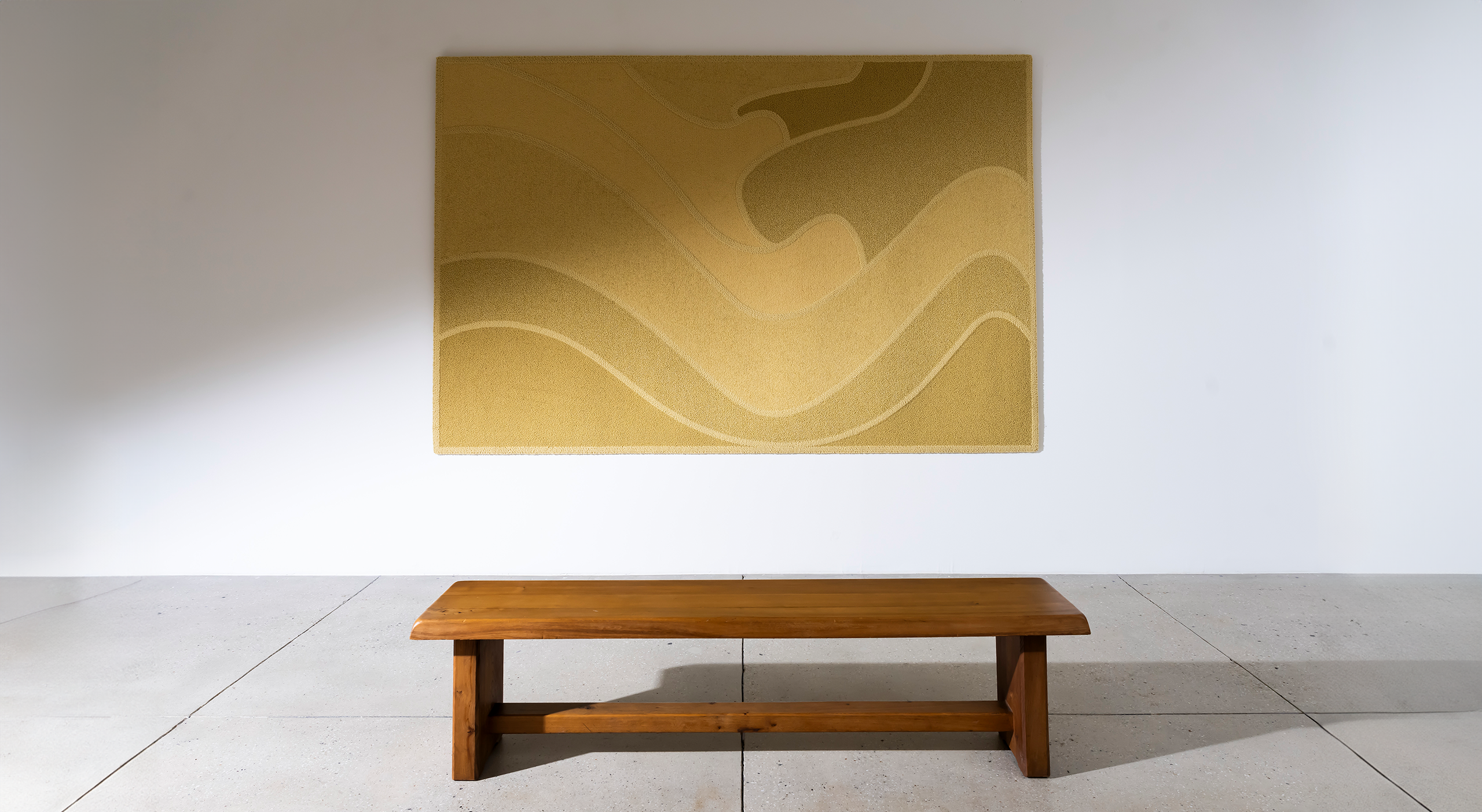
Bund was doing something similar, but different. Where Bund was installed, I had no rugs on the ground in front of it. Instead, I had a single piece—Bund—hung in a landscape orientation, with a lone Pierre Chapo bench in front of it. In terms of the perception of art, this was an even more explicit call out. Though it lacked a frame, its orientation and setup were immediately recognizable as a traditional gallery setting. I wanted to create an intimate moment between the viewer and one rug.
I could have placed a very loud piece here, but I wanted to bring attention to it in a very personal way. I wanted to create a space with no other works to compare to. I wanted to create a conversation that was focused. And I think, in a way, it became a little confrontational, too. The setup allows for a bit of vulnerability between both the viewer and the work—which isn’t discussed much in art, but it exists, I think.
The Pierre Chapo bench from Magen H Gallery, again, brings out this conversation about works in relationship to their surroundings. How the conversation is changed with the inclusion of certain pieces, and how it develops as the context shifts.
While you sit looking at Bund, you wonder, why am I looking at this piece? Why is this piece here? Why is it displayed in this way? There’s a lot of back and forth between you, the space, and the piece.
And giving a spot to rest, there is relief there again.
I think sometimes there is an assumption that when a piece is displayed differently, especially in this way where the other pieces in the gallery are formatted similarly, it is because this piece is better than the other ones, more special. But really, you could put any piece there. And that’s what I love about it.
They are all trying to focus you into a more intimate and in-depth experience of the piece that’s in front of you.
