Relief Beyond Ground, Part 1
In relief, I think of both sculptural and printmaking techniques, as well as the removal of pressure, particularly the pressure around the idea of art and how rugs are perceived.
With this exhibition, my aim was to introduce conversations around what constitutes a painting, what constitutes a sculpture, what constitutes an installation, and where our works fit into this conversation.
In the spirit of probing this figurative boundary within art, I began looking at the relationship of frames within these textiles because the frame is often what people think of when they think of fine art—they think of paintings and drawings hung in museums.
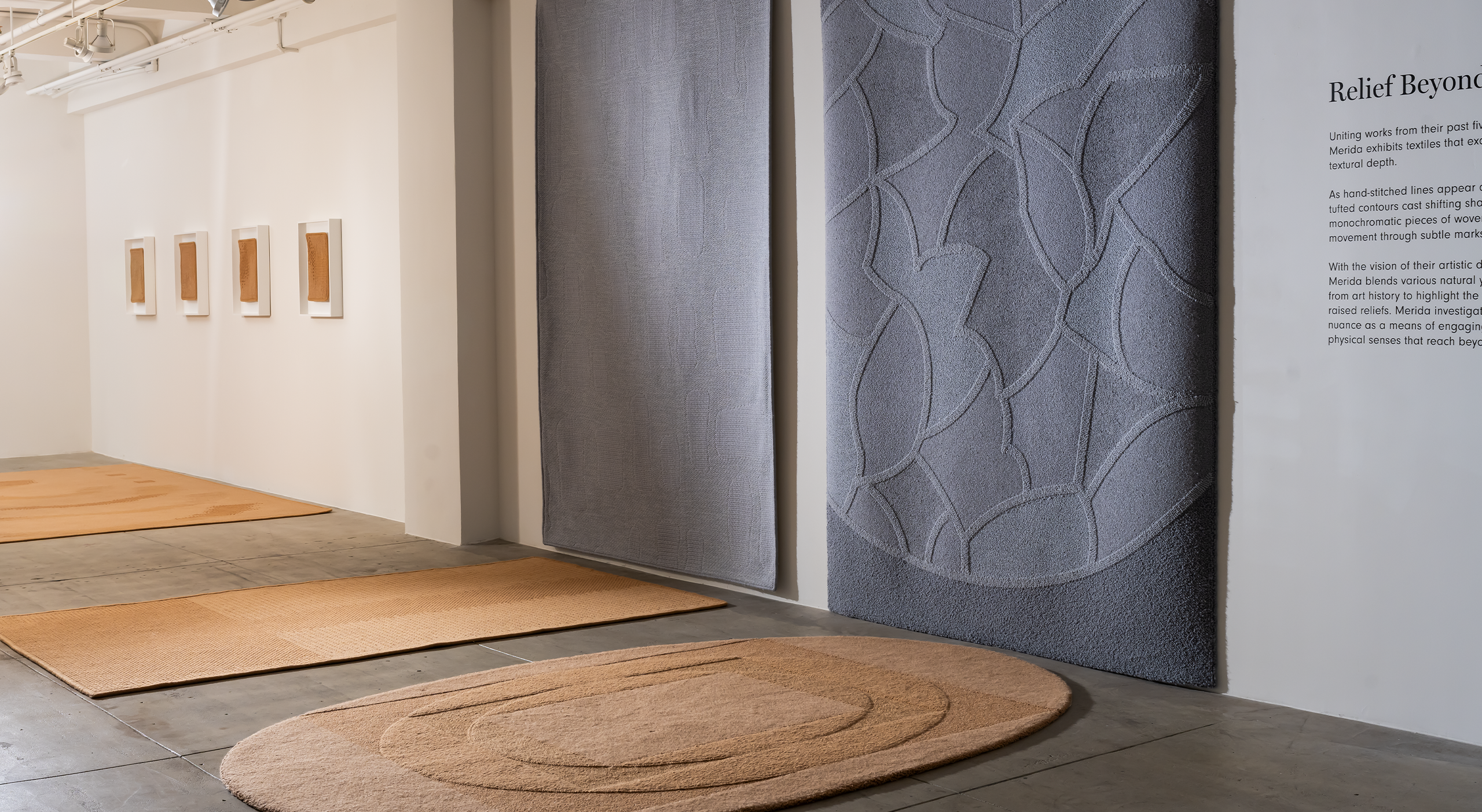
Frammento and Ray look at this relationship more explicitly, as there are plays with frame in both, as well as between each other when situated next to one another. I thought this pair was interesting because of each’s use of borders or parameters, each containing the other. Frammento is a rectangular rug frame containing a fractured circular motif, and Ray is an oval frame containing a geometric arrangement of rectangles.
Then I began thinking about how the formal frame would bring this question of art out even more, linking more directly with the language of art that many museums and artists use. I began thinking, could a rug or a textile be framed?
That probed some of the questions around textiles being framed, but what about textiles as frame? Within an environment, they can frame a conversation between people, they can frame the conversation occurring in a setting of furniture.
While planning this exhibition, it was important to me to show that Merida’s artistic language and conversations have been consistent throughout the studio’s body of work. Simultaneously, I didn’t want everything to feel too similar. I wanted each wall to have its own identity, and I wanted to elevate the individual voices of each piece.
In order to give space for each work to communicate its own voice, I used color to create separations and transitions within the gallery.
I wanted to use neutral colorways to keep the focus on the topography of the pieces, but I also wanted to highlight Merida’s adventurous side with blues, pinks, and yellows, so I decided to highlight unique colors in areas with a lot of traffic, using these as my anchor points within the gallery.
With this primary color scheme, these higher chroma moments encouraged you to move through the different sections, wandering from one zone to the next. In between these primary colors were swaths of interesting neutral tones, breaking up the saturated spotlights while offering intriguing and dynamic texture.
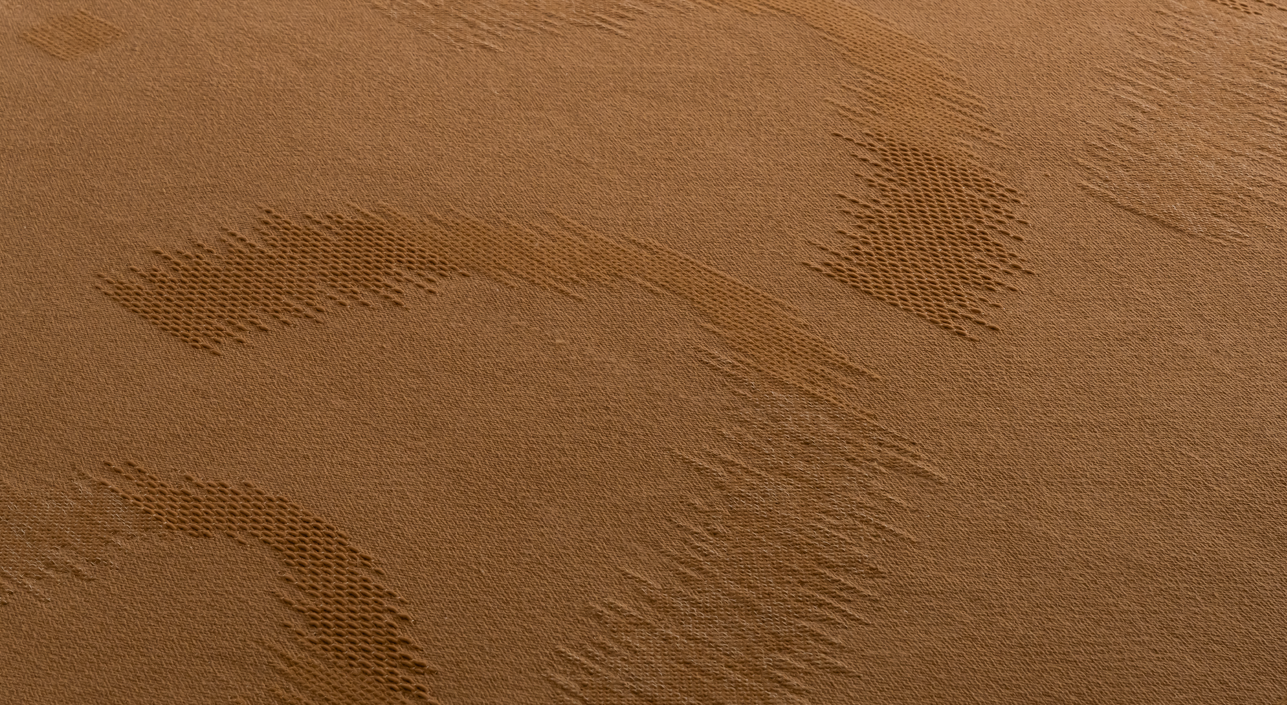
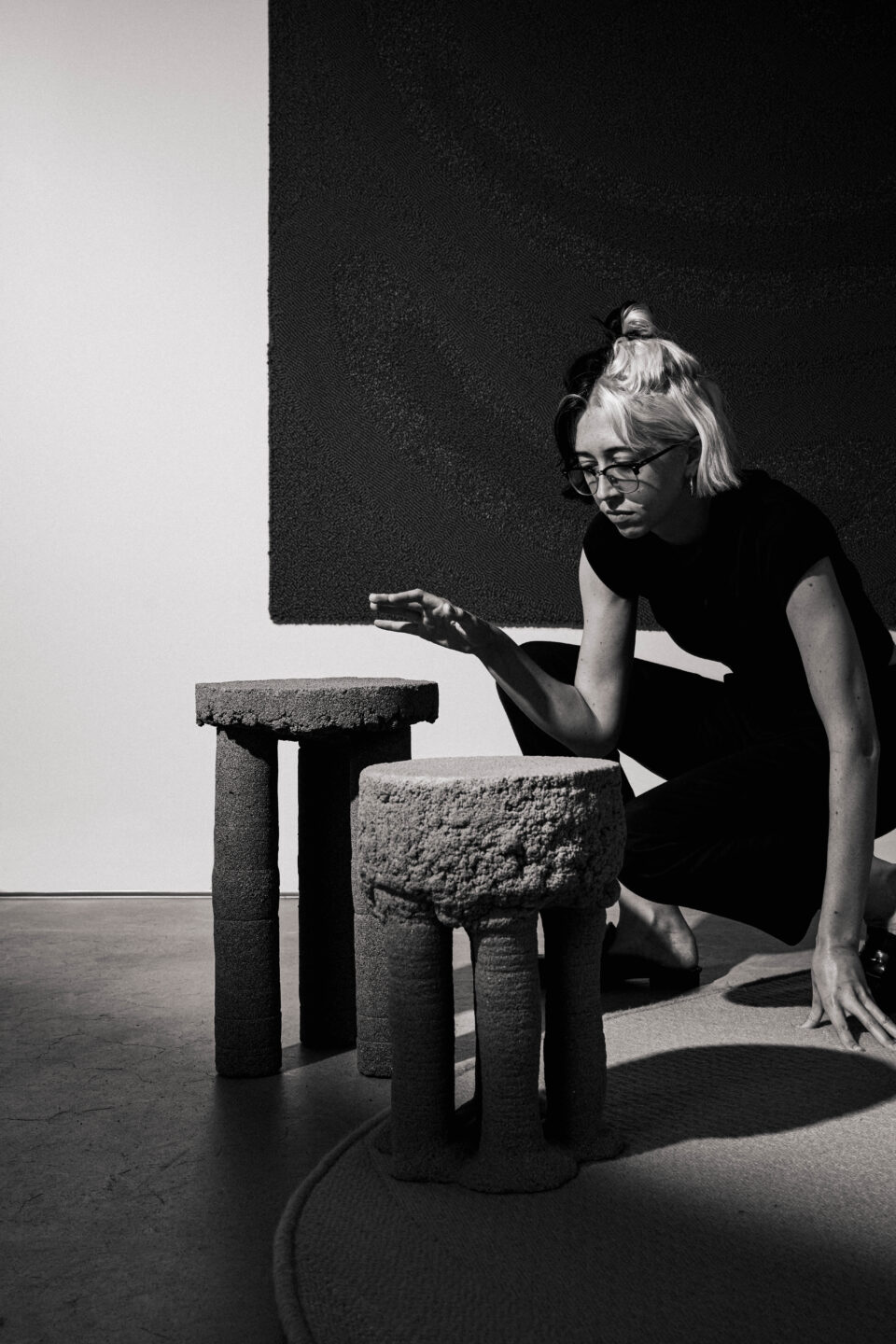
As I was planning the exhibition, I wanted there to be a complete sensual experience as you walked through the space. There is a lot going on when you walk into a room with these textiles because you are met with the scent of the wool, you watch the light and shadow shift across their surfaces, and you feel the topographical changes in the textures of their fibers and weaves. Because of this, there is a lot to engage with, so part of what I wanted to do was slow people down. I wanted to encourage people to really take in what they were experiencing, with all of their senses.
To achieve this effect, I thought about aesthetic transitions with color, line weight, detail, and scale. I realized that when you stare at one thing for a long time, your eye begins to crave the opposite. So I decided to lean into that, both by following that natural rhythm and disrupting it.
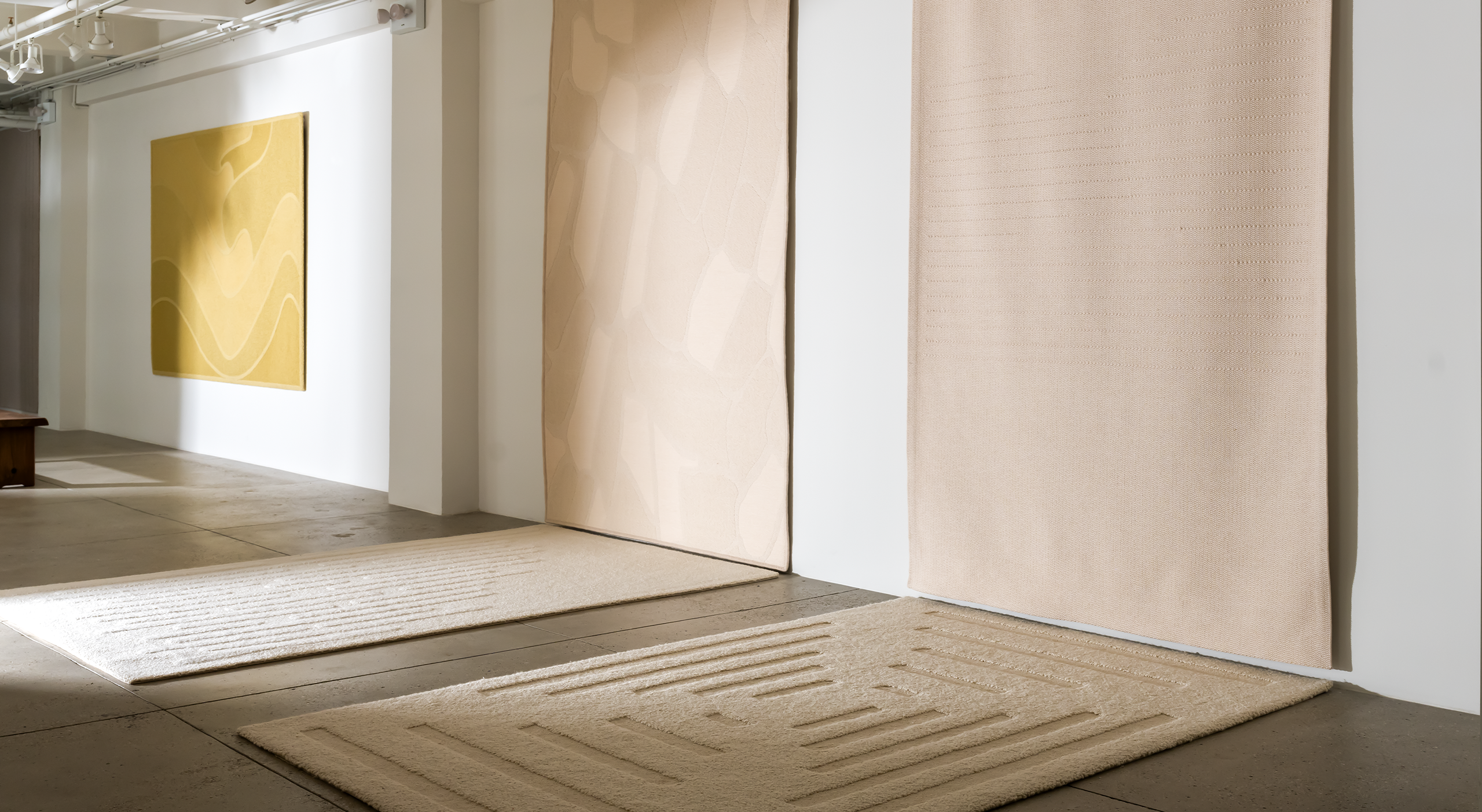
I began to think, what are your feet craving? When you’re in contact with the rugs underfoot as you walk through the gallery, you form your own rhythm. So to keep the viewer constantly conscious, I purposefully reoriented the rugs.
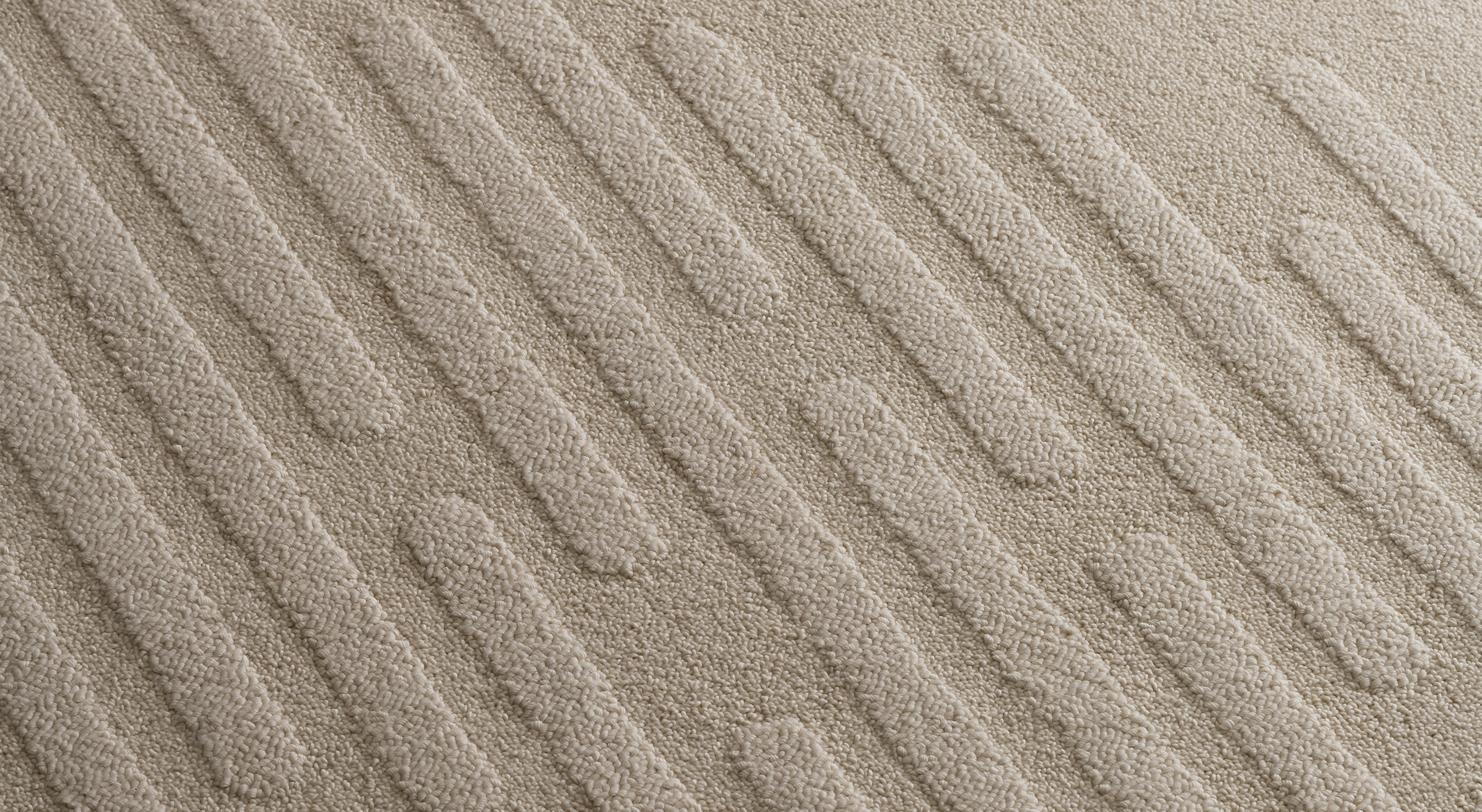
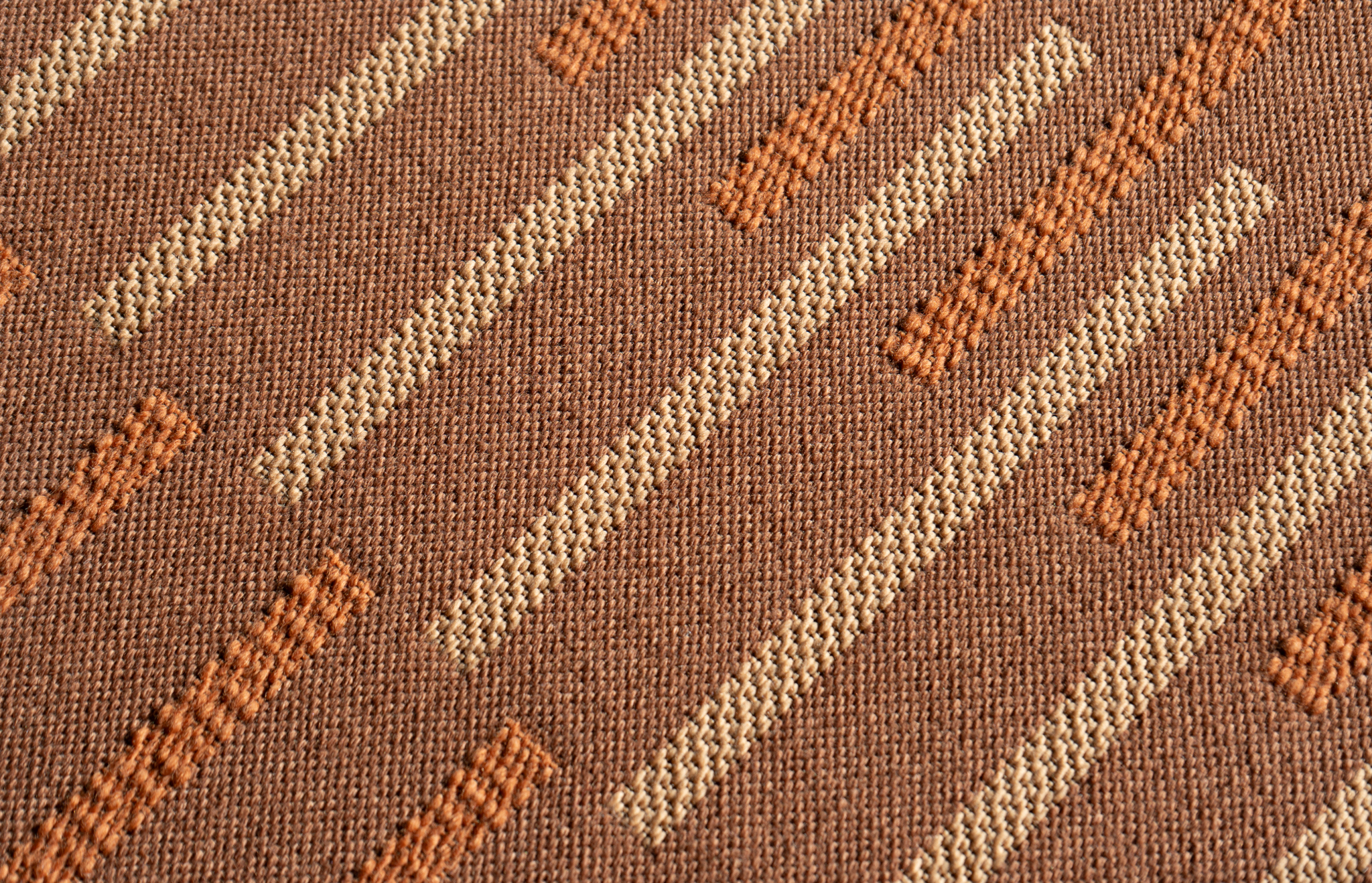
For example, Mirage guides you in one direction with its lined reliefs, but as you cross into Mantra, the same lines seem to shift under your feet. Suddenly, the orientation of those ridges has changed, and going from a piece that is running in the same direction you were walking to one that is perpendicular, you suddenly feel a friction. It makes you question your unconscious action of walking. It makes you reevaluate what you are walking on. It makes you ask, am I walking on the same thing? And then you start to turn your body.
So the idea is to not only guide the gaze but also guide the body. By allowing people to read each wall differently—as pieces are displayed in portrait, landscape, and framed—it allows people to further investigate the why.
Why is it hung this way?
Why am I seeing it this way?
What attention should I be giving?
What details are they asking me to inspect closely?
What am I experiencing?

