World of Color
The final chapter of the Atelier Period reflects a deeply personal journey as I reflect on my experiences in and connection with Japan. The colors created for it, thus, were born from my time in Japan, where I was moved by the quiet strength of its culture—the balance between restraint and expression, tradition and impermanence. Each hue carries an emotional imprint from that experience, translating moments of connection, humility, and beauty into color. Together, they form a palette that closes one chapter while honoring everything that has shaped it.
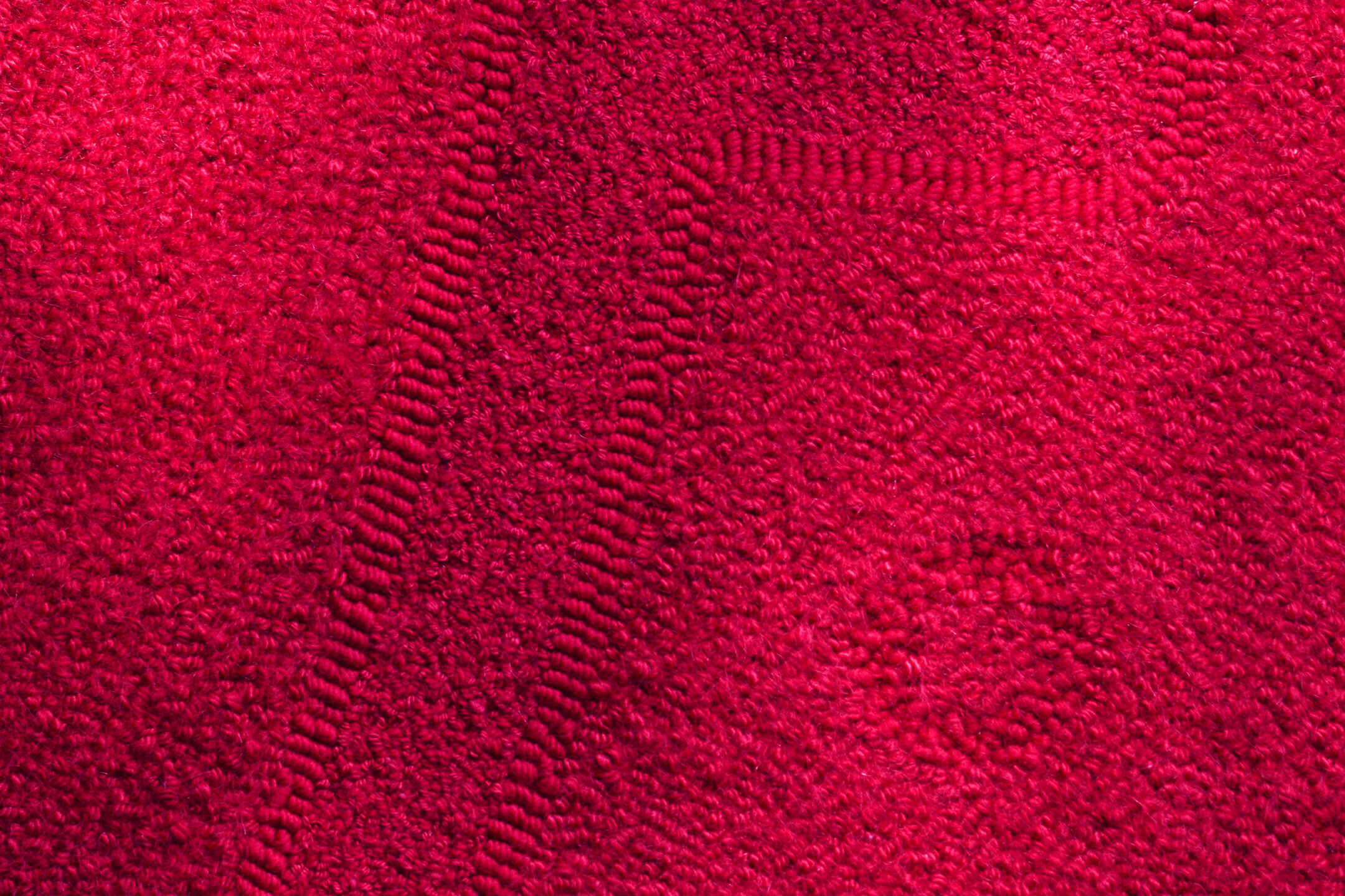
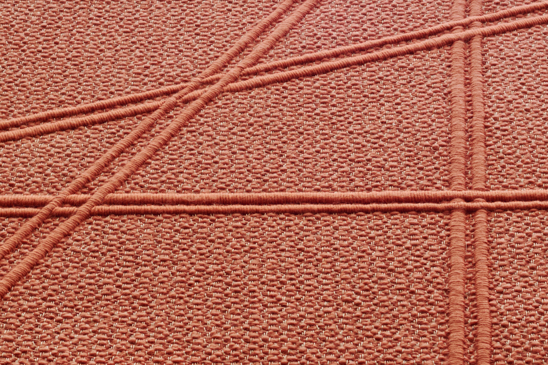
Aka
On one of my trips to Japan, I was introduced to a girl who had members of her family that were part of a Buddhist temple. I was lucky enough, through them, to be invited by a monk in their family that I knew well to spend time with them in the temple, eating vegan food. And in that tradition, there is a series of bowls—ōryōki—that you need to have based on the season and based on what you’re eating. The number of bowls is really important, but they’re also lacquered with this super vibrant red color—and that’s what Aka is connected to. It’s connected to that moment, what I learned about how the monks live, how they see nature… it was something that stayed with me long after and helped me grow as a person.
So I’m always going to be grateful to them, even if I’m not connected to them or I’m no longer around many monks. I keep this treasure with me. I see it surface in one moment or another—it has appeared in one of my Paris textiles in a different way. So sometimes it’s back and forth, and here, it’s in Aka and again in the only circle rug for this season, Voyage. This is also why the name Voyage—”voyage,” which is “traveling” or “trip” in French—because this piece makes me feel how I feel about that trip. But that trip—not just going to Japan, but specifically that trip with them in their temple—is meaningful for many reasons, personally, but it’s also meaningful because of the Buddhist culture’s link to Japan.
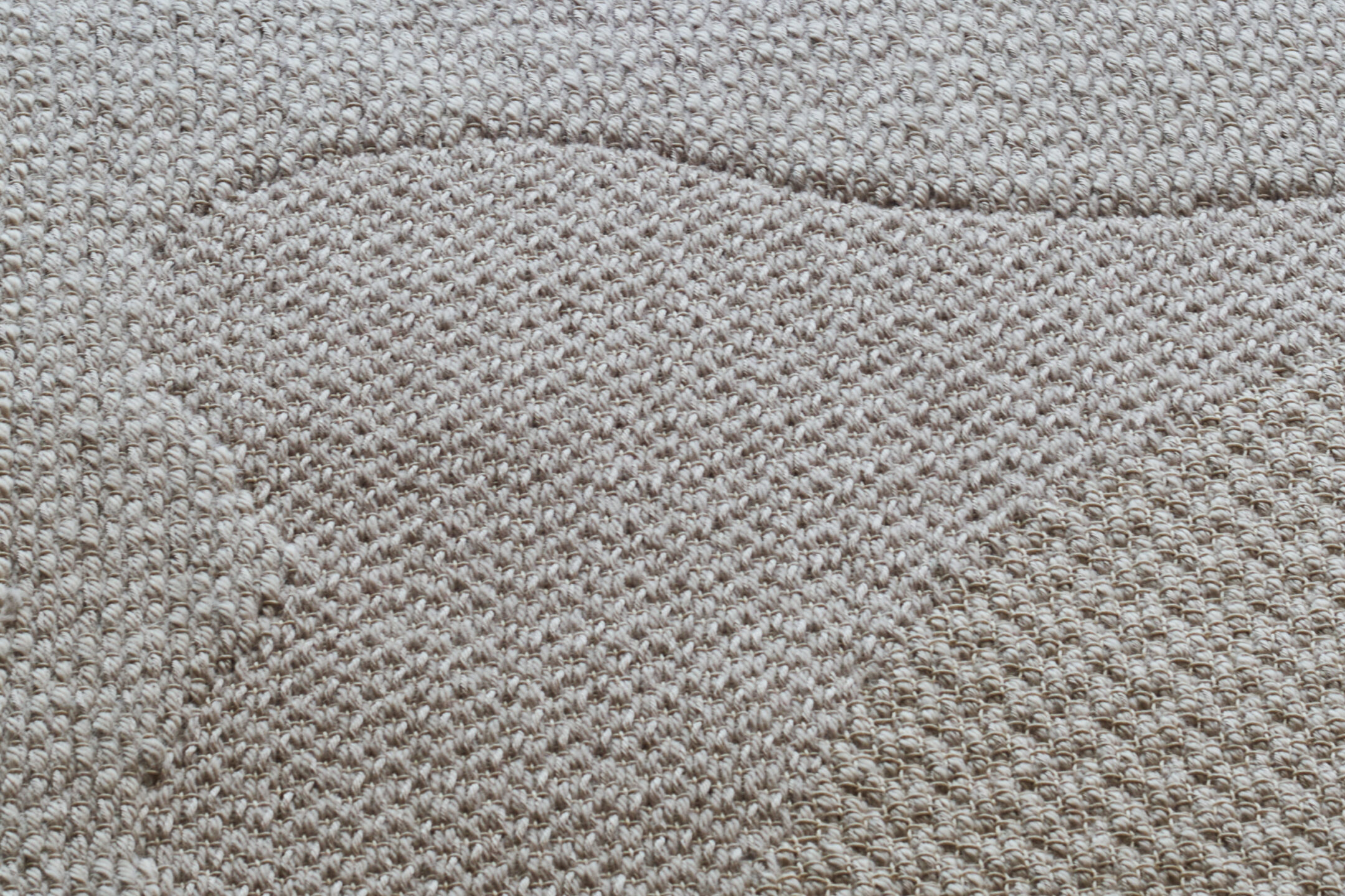
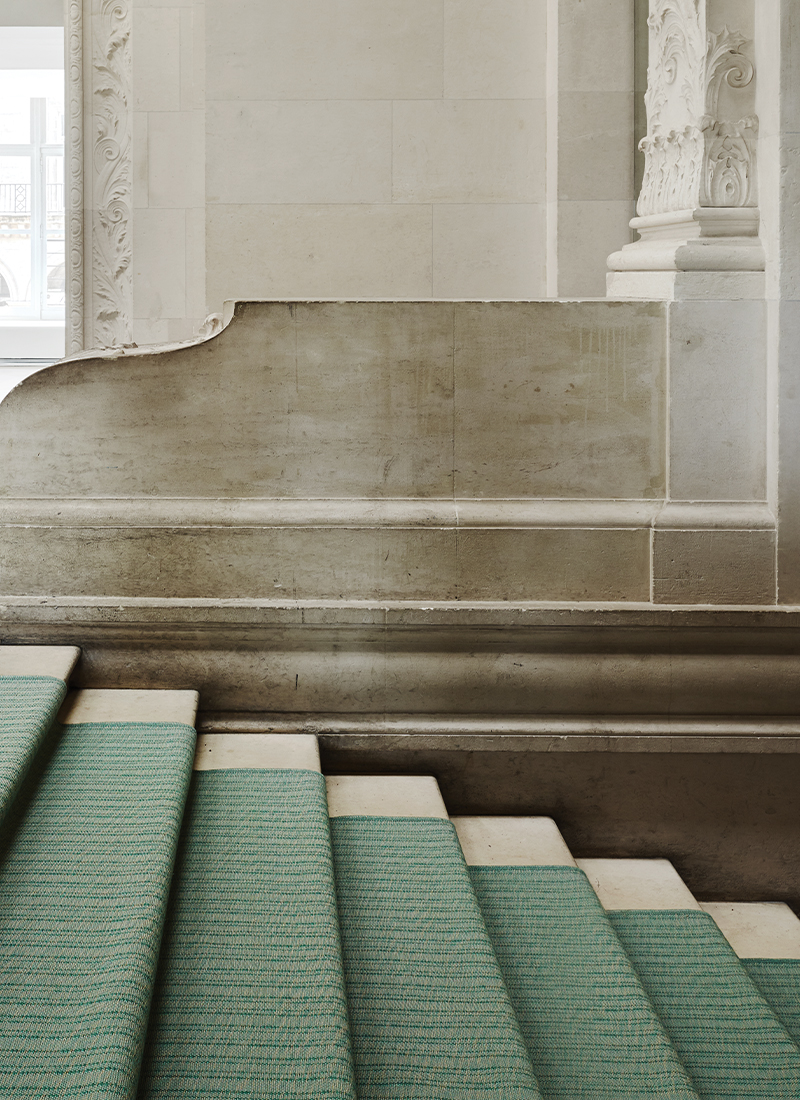
Reed
Reed is in the mountains. I went to one of the oldest onsen in the mountains in Japan, where the river passed through the middle of the onsen. An onsen is a hot spring in a ryokan, so it is a private onsen, and this one was surrounded by wooden things from the 17th century. This Reed color comes from a moment I had while sitting on my futon, just before nighttime, looking at the pebbles and stones of the river lit up by a half-moon. The earthy element of the river and its stones illuminated by this cool, dim light brought me Reed.
Zen
Zen is two things, really… Sometimes when I’m in Japan, in a place like Shibuya for example, I get really overwhelmed. I love Japan very much, but in some places there are so many people that I just want to escape. So when I’m in a place like that, surrounded by all of these people and goings-on, I put myself in a bubble so that I can get where I’m going. To me, this is part of the Zen color. The other piece of it is a tea house that I visited while in Kyoto. It was a private tea house within a home, and though it was not a perfectly run tea house, per se, because it had not been used for a very long time, it was still beautiful. The spirit of the tea house was perfect. That is the other element of Zen. So Zen is less about the color of an object as it is about a sentiment—in particular, ma.
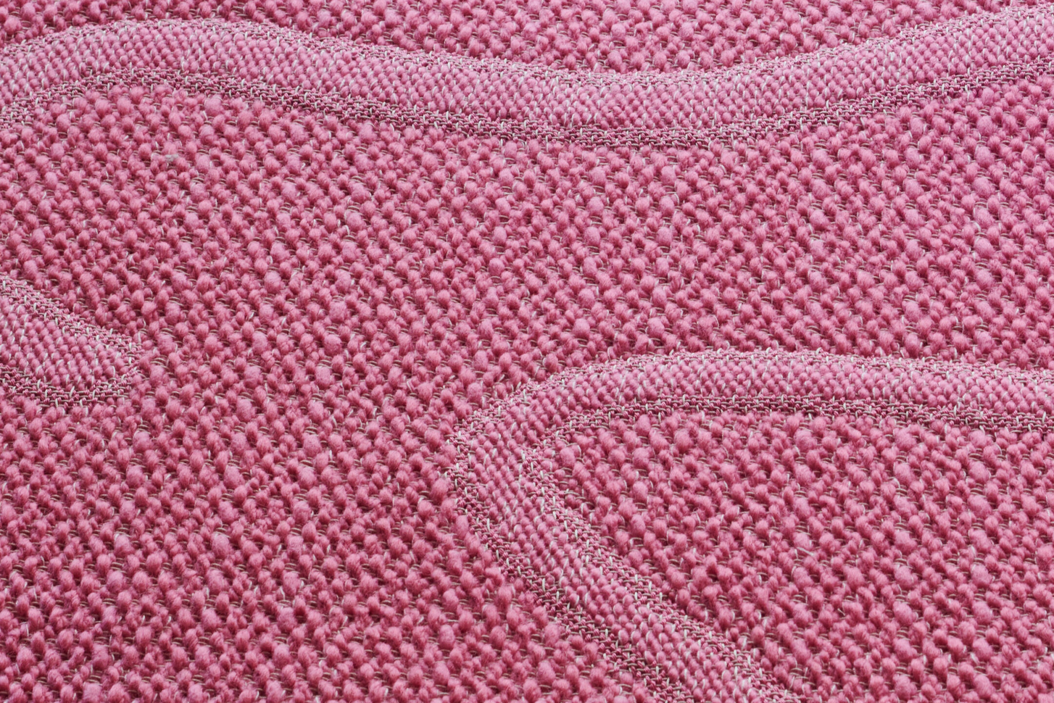
Petal
One may think from the name that the Petal color is a direct translation of the cherry blossoms of Japan… but you might be surprised. As many people know, I’m not very into crowds, so I don’t go to Japan during the spring very often. But once, I was in Japan in the spring and the river in Kyoto was full of flowers, the pink cherry blossoms falling all over, and a friend said, “Oh, let’s have a picnic.” And though I would’ve loved to, I knew that it was going to be too crowded for me, so I went back to the ryokan I was staying in.
While I was there, the grandson of the old lady whose house I was staying in came in and asked me, “My grandmother wants to know why everyone’s out and you’re not,” because I was the only one staying at their place. I told him, “I love what I see, but I don’t like all of the people around that I have to see it with, I cannot stand the crowd.” And so his grandmother, absolutely adorable, came to my room at dinnertime with a kaiseki and said, “I am bringing to you what is outside.”
She had eggs and things that were white, but made many dishes that were pink so that I could have the cherry blossoms—to enjoy what I was supposed to enjoy outside. I will always be grateful for her. I always cherish the fact that even though I didn’t speak Japanese very well, she and I were able to talk about things in one way or another. She was so patient and amazing to have me in their ryokan for so long… so this is the feeling behind Petal, even if there is the actual cherry blossom within that.
Sparrow
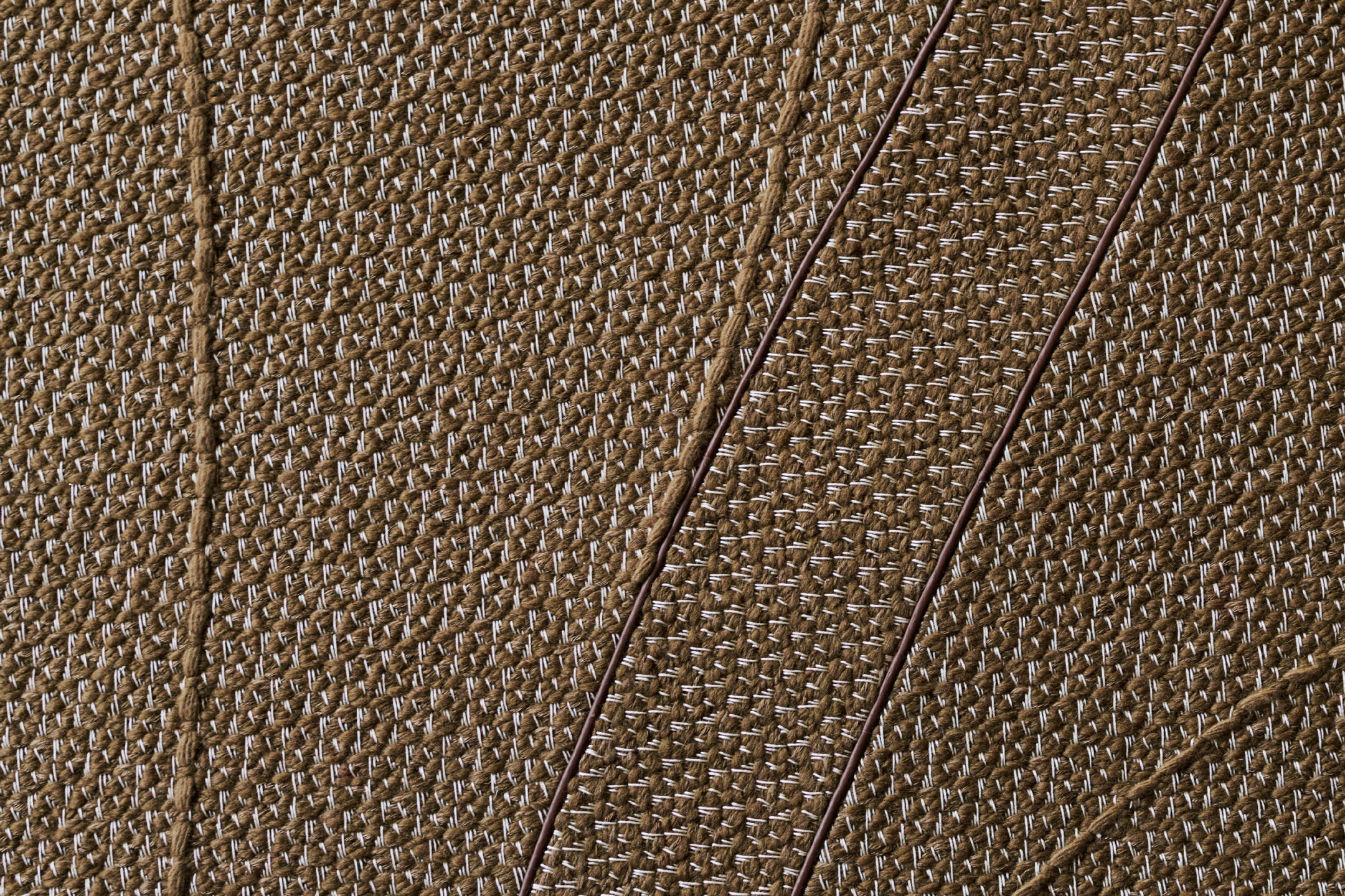
Sparrow has multiple pieces to it, as well. If you look at Japanese prints—and of course, many people are going to think of Hokusai and the Wave, but aside from those—there is a kind of contour that is used to highlight something that is important. Sometimes, when you sit in Japan at twilight, everything seems perfect, and you see some birds that, perhaps, are not so perfect or beautiful on their own, but they highlight the beauty of the moment. When I sit in a moment like that, the beauty of those Japanese prints comes to mind, and thus the name of the color connects to its spirit.
The other piece of the color comes from spending time in places where they make soba noodles. I myself do not really care for soba, but I go to spend time in these traditional soba houses because I love watching them craft. It seems that in these colors, I am talking a lot about food, but it actually more so about the building that soba is made is rather than the noodles themselves. When you go inside, they make the soba in front of you, and you get to see all of the hand work that goes into it. The way they make it, you would think they’re making ceramics, not food. The wood that surrounds them in the architecture is the color of Sparrow. Some of it has been burned from years of smoke and cooking, but it highlights the talent of having made things for generations… the same family may have been running this shop for more than a hundred years.
This is what goes into any Atelier piece: not only the value or skills, but the piece of yourself that you put on the table for the sake of the piece.
Coral
Coral is mostly an ideal. The color Coral is not coral at all. This color is mostly based on the Azalea japonica… but again, not directly, in the way you may think. It is what the flower conjures, more than the flower alone. The shape of the flower reminds me of a certain type of seafood that you can only eat in November—you only have a month to eat it—reminding me how connected nature is. So when I see this flower, I think about this seafood, and I think about the season and the water… and the name Coral conjures that sense of water, but it is more about how the seasons are important. It’s about how each season is important in life in Japan and in Shinto.
Seasons are important to me. Even if I grew up in a place with only two season—the rain season and the hot season—in between, you have little seasons to help you be more patient for the highlight of the season. This color reminds me of the fact that the way you feel is not linked to the season itself, but what is happening within that season. So in this case, it’s the shape of a flower connected to the shape of a shell, connecting to the ocean, conjuring a moment that connects to the season. So Coral, to me, is a complicated color. When you look at it in different pieces, you see a different color. What’s going on inside something is more interesting than the whole thing.