Experiencing Elements
As Elements: Outside Within approaches its close, Brand Manager Sarah Barkowski sat down with Gallery Manager Aaron Chung to discuss his unique experience of the show, his favorite moments within it, and its impact on future exhibitions.
SB: How is the experience of walking someone through the space different from previous or future exhibitions?
AC: Usually, I would start in front of the wall text, which sets the tone, and then guide them through the pieces on the wall and their interaction with the floor.
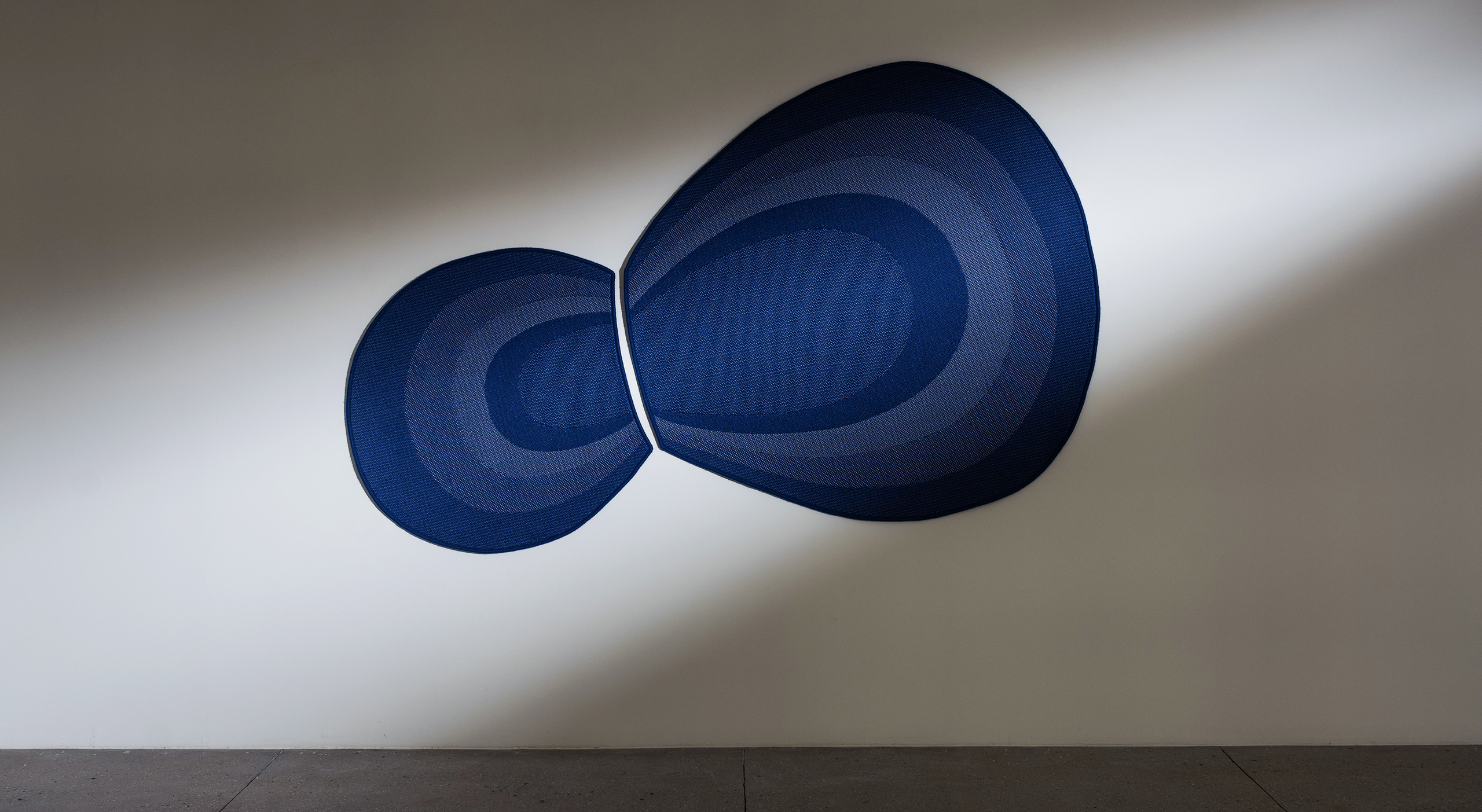
But this exhibition, Elements: Outside Within, really plays with the relationship of color. So, even though there’s no right or wrong way to walk through the exhibition, I think the best starting point is in front of Duo.
This moment is impactful not only because of Duo’s solitary position on a large wall but also because in front of Duo, you get a beautiful vantage point of the exhibition. You can see all of the colors and the arc of that story, all while the shapes of each piece guide you down the gallery corridor.
When you start from this vantage point and slowly explore each piece as you traverse the room, you will notice a subtle unveiling of surface texture and how the colors read based on your distance.
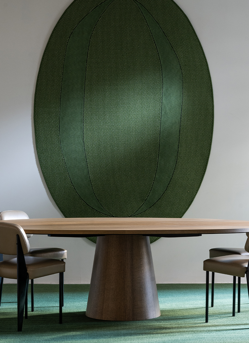
You definitely experience this with Tephra. I think the conference room might be my favorite space because of how dynamic not only the color is, but the piece is. We all jokingly say that it is our James Turrell because it really does feel like a piece that glows. From a distance, you see this light emanating from the center, and as you walk closer that value and graduation change.
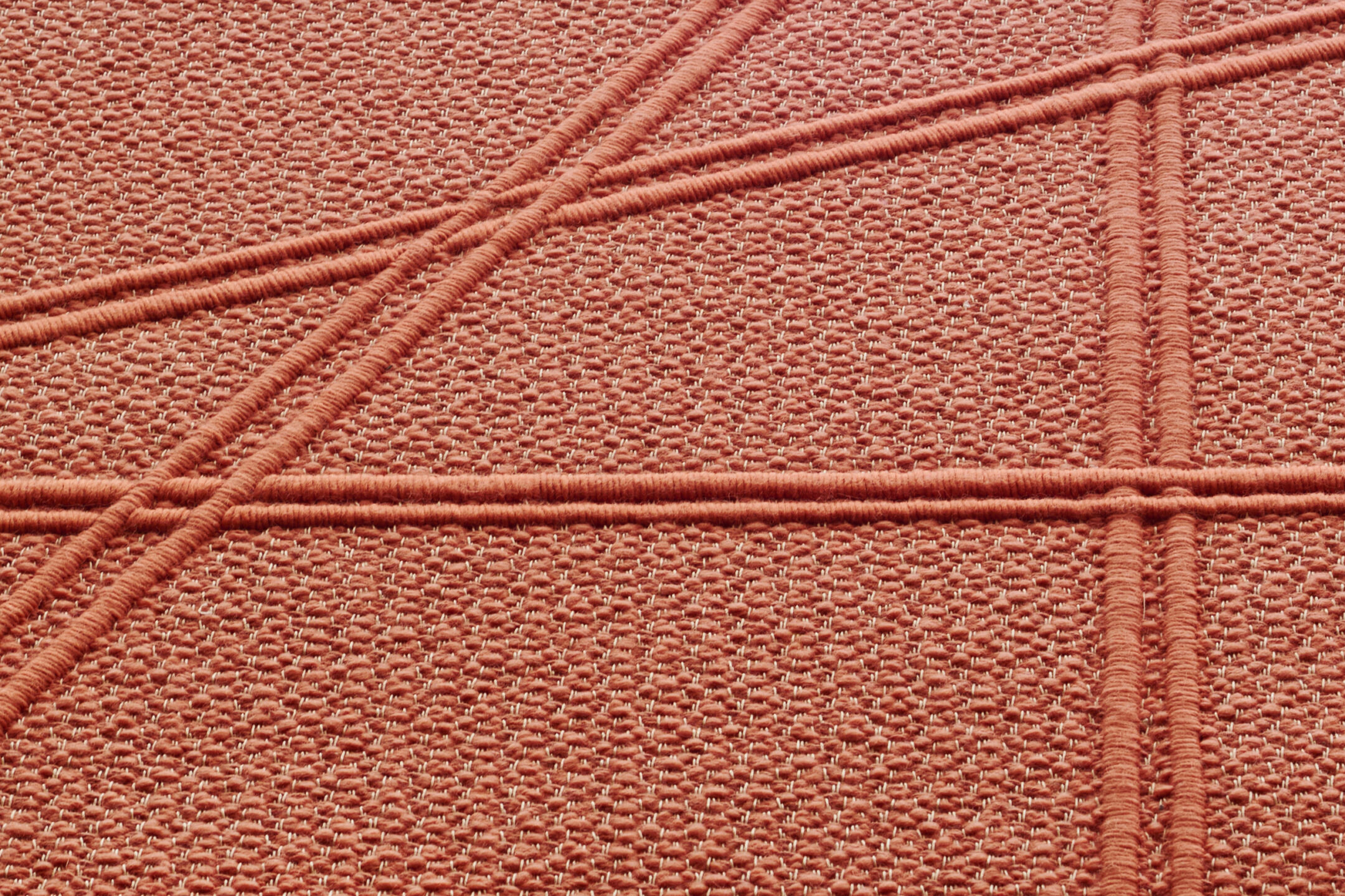
As you experience the piece, you start to see all of the knots and textures reveal themselves, and you see the subtle shifts of color and light in the weave, and then you notice the leather details, and you form this entirely new appreciation for the textural nuance of the piece.
It’s not a perfectly symmetrical piece, either. The oval motif within the beveled edge is purposefully off-centered. There’s an angular intention from Sylvie in the top right corner.
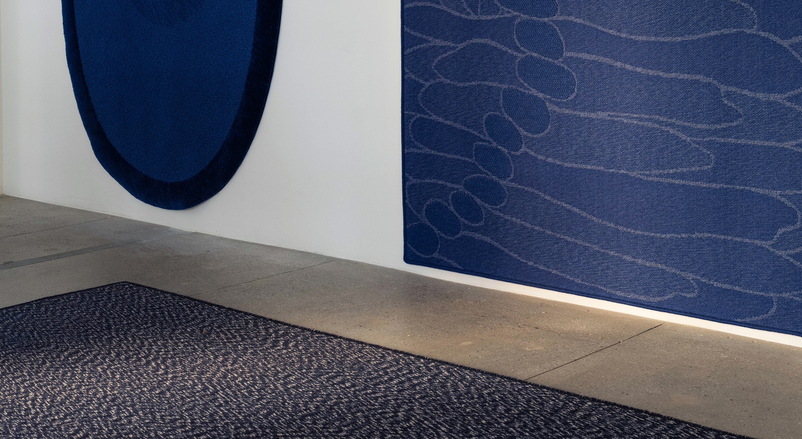
You don’t see those little details right away from where you start in the distance—or at least where I would have guided the visitor. But you walk closer and closer to each work, you start to see those subtle shifts in detail. There really is no wrong way to approach this show, though, because if you start on the opposite end, you can still achieve that same effect with the Brook pieces on the other end of the corridor.
But I prefer to start where Duo is just because, from that vantage point, you get this optical skipping effect with each hue and how they are lit.
SB: if I had to choose a single piece for my space at this moment, it would be Tephra. And I would put it on the wall just like it is in the gallery. It feels very wabi-sabi to me because of the irregularities that you were talking about, and I think that’s what makes it very beautiful to me—especially with that rich Fern color that is so strong in the natural light.
As you mentioned, Tephra is one of your favorite moments in the exhibition. Do you have any other favorite moments in this exhibition?
AC: Reef is one of the pieces that surprised me the most, not just in terms of appreciation but also in terms of its value and presence.
There was a brief period when we had to remove Reef for its showcase in Design Miami, and we replaced it with another piece of a different color, and the whole exhibition changed. Reef is such an eye-grabbing piece with its rich red color, but its role in the space was more than that.
Due to its absence, I think I’ve grown a wider appreciation for not just the color but everything about it: its shape and all the power it exudes.
Referencing Sylvie, the reason that the Lava colorway is in the center of the show is that it is literally the core of the exhibition. Reef’s color refers to the magma underneath the earth’s crust that becomes lava and, eventually, the core of our natural environment. So, referencing that natural relationship, the Lava piece is the core of the exhibition that holds and grounds everything together.
SB: I know back when Outside Within was still just developing and the design team was working on it, you were immediately drawn to Duo because of its unique diptych structure. Since the beginning, you always had this idea to put it on the wall. Can you talk through what it’s like to now see it on the wall as you had imagined?
AC: I really stand by my decision to have Duo on the wall because it’s the first piece that is truly unique from all the other works we’ve made. It being a diptych, it being this unique teardrop shape and its incorporation of multiple Jacquard-woven grounds make it a highlight for a number of reasons. There’s so much going on with the layering.
The way it’s displayed is not perfectly horizontal or vertical. We displayed it in this off-kilter way, which I think emulates many of the other subtle gestures that the works that appear symmetrical also explore. I love that we’ve emphasized Duo’s dynamic hourglass shape through this orientation on the wall.
SB: Some of our series are very geometric because of the references that Sylvie is pulling from, but others are very organic. The Outside Within pieces on display in this exhibition are very organic, and Perception of Light also has a lot of organic motifs and silhouettes.
I was curious if you had any thoughts about the thematic ties between series and how these varied pieces feel different in the space. How does the experience of the space shift with the shape language?
AC: The visual narrative and experience of Elements: Outside Within are such a refreshing change from past exhibitions, not only with the introduction of uniquely shaped rugs but also from the amount of negative space or breath we’ve included surrounding each work—especially the pieces on the ground.
I remember when we were installing these pieces, people on the team were wondering if it was going to feel empty, if it was a little too spacious. But I think the decision to show fewer pieces on the floor, like we did with the sample wall in Relief Beyond Ground, was a smart choice.
Giving these floor pieces more space allows the work to speak more, because each is given their own moment. My eyes skip along each piece in a way that feels exciting and natural, and it doesn’t feel claustrophobic.
In terms of the exhibition and the way it is installed, there are a lot of things that echo the rest of our body of work, whether it be motifs, thematic overlap, or simply material. But the way we presented this show, in contrast with our previous shows, is much more sophisticated and mindful of allowing the work to speak without it being visually interrupted. With other works surrounding it, everything feels complimentary.
SB: Do you think that display choice of “less is more” is significant for this particular curation of pieces or do you think that that speaks more broadly to the display of our works in general?
AC: I think it’s a little both. It was intended for this curation, but I think giving each piece its own moment has always been our intention. It just took a while for us to find the right balance.
I think it is this need to create what I originally said visual hierarchy, but now think is simply the need to give each piece this platform to play the role of the main character, and this show definitely encouraged that.
SB: We have a gallery space where we are displaying multiple works, but I think in the end, collectors will likely be displaying one or two pieces in a space, so I think that approach speaks more to how it will be experienced in the end, as well.
I know multiple people have said it—I’ve said it coming into the gallery—that the colors of this exhibition really make an impact. Especially seeing this curation in comparison to curations from our 2022 series, the colors make such a powerful first impression because they’re so like deep and rich. They fill you with a very different energy than our 2022 colors, which are softer and calmer. I was wondering if you had any remarks about the presence that these colors alone have in the space.
AC: I think our approach to color has always been a response to some question we are asking ourselves.
You know how every year Pantone releases a color of the year? I love that because when we see a certain color for a long time, our bodies internally create the opposite hue to balance it. When the rods in our eyes are bombarded with the same wavelength of light, they compensate for that imbalance. That’s at least the scientific color theorist approach to color.
I think for us, the colors we create each year are this natural urge to create balance for ourselves. In 2022, we created a palette of pastels while exploring a specific theme; but it’s not surprising that we are making such strong and vibrant colors this year because it is ,in a way, not only us expanding and exploring new color compositions, but touching upon our emotional, internal, and artistic needs.
I think it feels appropriate. That’s why when I look at these colors not like oh, we’re so wild and innovative. It’s just like, no, like the timing is appropriate for what we’re doing with these works and like the next colors we’ll see. I’m sure I’m going to have a similar response to the next colors.
SB: I’ve always seen this even within graphic design. I remember really early on noticing the Netflix interface changing from white and red to black and red, and back again. They kept switching back and forth every few years, and it felt like everyone else inevitably followed. So when I see it being dark now, I know in a few years, it’ll be light again. We need change, we need balance.
That’s how I think of our colors as well. The saturated, energetic colors of 2021 like Barragán and Venus being followed by the pastels of 2022 felt natural to me. Not only because of the saturation shift, but because when you view the 2021 and 2022 colors together, they harmonize.
I saw this in fashion too, these very saturated colors being followed by pastels, and by saturated colors again. It provides this fresh breath of air, I think. You need the change in energy, just like you need to rearrange your living room every once and awhile.
You carry that energy with you.
Do you have any closing thoughts about the curation or anything else that you’d like to say?
AC: I will definitely miss this show when we deinstall it, but I’m also very excited to see how the next show, and how our future exhibitions will continue to evolve.
SB: I always really enjoy getting to visit the gallery after we put in a new show, because the space does feel so different after every new exhibition is installed.
Elements: Outside Within will be on display until May 10, 2024.
