Color Conversations, Part 1
At the introduction of our six new colors, our brand manager Sarah Barkowski sat down with Sylvie Johnson to discuss her approach to color, the nostalgic influence of history and memory, and color’s role in creating impressionistic pieces of layered realities.
SB: So how are the colors of our palette related, beyond the fact that they are all mixes of primary colors?
SJ: My goal, since the beginning, has been to create a unique color chart. What that means in terms of the palette is that each color’s temper—like a human being’s temper—needs to somehow correspond with another color’s temper. It’s like in a family. That’s how I create color.
For me, color is like when we were talking about quantum mechanics. It is something alive because it has multiple atoms. This is what it is for me. Quantum mechanics is a great metaphor because if two particles connect once, they are connected forever. It doesn’t matter the distance, which is light years between them… and this goes back to how you create a unique color chart where each color is a particle, and there are connections between them.
This means that if you see one piece in Hanami and one piece in Dew—they are not the same color—one is pink, and the other is blue—somehow, you know that they are related and that they came from the same color chart.
It’s like when someone has seen my work in one project, and then sees another piece of mine, unlabeled, elsewhere, they know it is mine because they can tell that these pieces are linked. So it’s not only that colors like Barragán and Hanami are linked because they are both pinkish. They are connected because there is a high level of positive tension, and with Hanami you are going to see something subtle but wise; and with Barragán you are going to see something dynamic but wise. It’s not that one is more powerful than the other: it’s that each color has its own aura, and it is amplified and quieted in different contexts, with different light.
How they are linked is the goal principle since day. It has always been to create a unique color chart.
SB: How do you select the colors that will be introduced each year?
SJ: The direction of the series has an influence on and resonates with the colors chosen. The colors need to have something to say that will create a partnership between the pieces, the yarn, and the art, the references.
This is why the yarn colors are so important, because even the creation of the yarn color starts with heritage. It starts with the colors of old, antique color charts. So I’m starting with real color made by master colorists in the 19th century and beginning of the 20th century, and some even older than that. So again, we’re talking about colors based on color charts.
But even for the 2019 series, the colors were more inspired by earth’s color, earth’s pigment, so I found something close in the old color charts, and then added things in related to the colors of the earth, like the ochre pigments found in Roussillon.
So much of the time it is a color I have seen—out in the world, out in nature—that has captivated my mind. It has stuck in my brain because of how I saw it at that moment: the light that was there, the shadow that was growing in a certain way, the amplitude of the space because of the color. And the whole thought process around color is, how can I rebuild that?
I start by using these color charts, but then I complement them with words that are meaningful to get something that does not exist; a combination of nature, a painting I’ve seen, art I saw, and the color chart. It’s never just the color charts alone.
From there, it’s not, “Oh, I want a little more red in here… a little more blue.” It’s, “How can we have a color that is more assertive?” How can you create a color that evokes a watercolor effect, but not the effect of fresh watercolor, the effect from watercolor that has set for decades. So I would say, “It’s something where the surface and the edges are still fresh, but the inner color seems solid.” Those kinds of notes, those kinds of adjustments and conversations.
So I’m thinking that way, but after I narrow it down, I have these artistic conversations with the dyer. This is how we start.
After that, we have the thin-felted wool and the mohair dyed, because the thin-felted wool takes the dye like the center of a good tree trunk, and the mohair is like a young leaf. So you can understand the range within the color using these two yarns and fill out the rest of the branches with the other yarns. I say this in terms of a tree because it’s easy to see: the trunk of a tree has its own color, the branches have their own color, the new leaves, the old leaves, the buds on the branches. But they all have the same root.
You can see all of this in a single yarn card. It’s multiplied through the six yarn cards of a series, because every yarn card takes different yarns and works with a different color… but somehow, this is the mystery and the magic. Even those colors that are not meant to be together, make sense together, in a way. For this mystery part, I do not have the answer.
I think with any artwork, as an artist, you are thinking differently than most people.
If you go to quantum mechanics, it’s the Higgs Boson. The boson connects the particles. And it’s all of those connections that make the color chart. This is what makes the yarn cards that we have. Right now, you can see the conversations between different colors, but eventually, you’ll be able to see even the conversation between the various blues in our palette.
SB: What’s the reasoning behind starting with these antique color charts? Is it conceptual in that we are building on the history of color? Is it that those historical colors just have a certain quality to them?
SJ: In my work, the colors I’m choosing have this sense of the past, even the yarns that have already been dyed. So any time I make something new, it always feels already old—in a good way.
Because me, I’m using for sure, way more yarn, way more color, and anytime you feel that it’s not something new, it’s already something old in a good way.
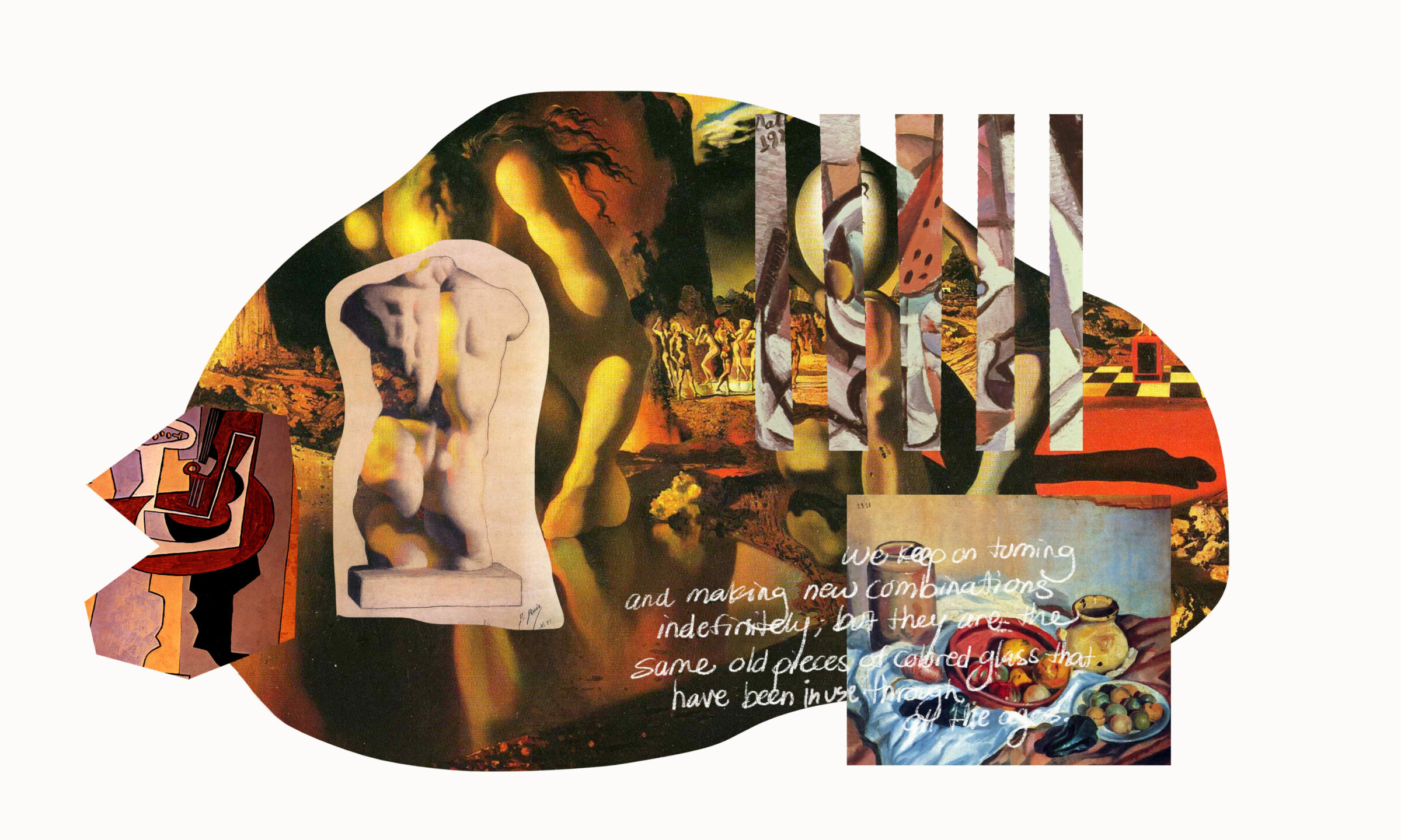
All of my life, I’ve been fascinated by these things. I love antiques, I love archaeology, I love all kinds of art. Many of the artists I love, like Rodin or Picasso, have archaeological collections, too. To me, it’s not just having something from the 18th century, it’s having pieces that are some 5000 years old that connect me to all of the things that have come before.
I never saw them as old things. I saw them as reminders of human beings’ culture. I see them as relevant today as relevant as they were to the people of Ancient Greece or Egypt or pre-Columbian cultures. For me, they are a reminder of how it is excellence is essential to last.
Why bother doing things that aren’t meaningful? Because you’re doing it for nothing. As soon as you leave this life, no one will care about those things because they’re empty, empty, empty.
So because of this, I’m never really asking myself what I need to do to be relevant… it’s just that I want to be one of the rings on the chain of excellence. I don’t know if my work will be a big ring or a small one, but I’m putting in the effort and hard work, because it can’t be passion alone.
Color is the same. I am creating colors that are relevant today and will be relevant tomorrow because in their DNA, there is already the past.